// QUANTIFYING EXTRAORDINARY
CLIENT: NORDA
MARKETING STRATEGY | BRAND DESIGN | DIGITAL & PRINT EXECUTION
Embracing The Future
After a legacy of over successful 25 years and visionaries behind iconic Perth landmarks such as Sorrento Quay, Mindarie Keys and The Vines Resorts, it was time to guide WA Architecture firm Wilkes Architects, to cutting a edge new brand experience.
To plan the road ahead, Noop were engaged for a renewed strategic direction, brand discovery, design and possible rename for Wilkes Architects. Utilising Noop BPM and an intensive multi workshopped process, we worked to establish the core of their identity and map every facet of this new and exciting brand.
On the Pulse – BPM
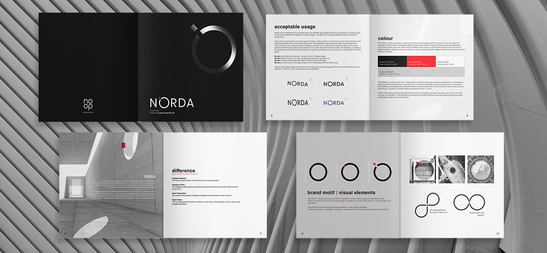
Noop BPM is a unique process that facilitates the solving of complex brand needs through exciting, facilitated collaboration. Guiding clients through the murky waters to a result of beauty and clarity. This allowed for the creation of a complete brand roadmap, detailing every aspect of the NORDA brand and how it relates to their ideal client’s customer experience.
Sharing a Vision
The journey begins by understanding who the client is and where they want to go. Knowing the ultimate goal and strategically testing the external influencing factors, means that brand success simply comes down to clearly planning “the best way to get there”. It’s imperative to getting decision makers on the same page and unifying the vision with the utmost clarity.
Through testing true difference and value reinforced direction emerges.
- Mission: “We exist to inspire better communities by connecting people.”
- Company Vision: “Our designs create profound impacts and improve the daily lives of our clients and the community.”
- Difference: “Our work is the process of design and design is the process in which we work.”
- Team Vision: “We are real people that relate to clients in a real way, so that together we can make a real, tangible difference.”
What’s in a Name?
Shifting from the Wilke’s Architects legacy and crafting a difference against the typical partner named firms we wanted to establish an identity that encompassed the full story of this energetic and passionate brand with a name that’s both contemporary and scalable.
Testing the outcomes of a rename through Noop BPM highlighted a new future as; NORDA (NO Ordinary Architects). A forward-thinking Perth based architecture practice that works to deliver extraordinary outcomes and to make an impactful difference.

Telling a Story
A new name needs a new story and a story starts with a why… we helped craft NORDA’s by establishing a clear brand story, based on their passion for extraordinary outcomes.
“Architecture is a visual art, in which the buildings speak for themselves. But when they speak something extraordinary – we stop and listen – we appreciate. We contemplate the journey involved, the culmination of factors that make the extraordinary possible, the circumstance – the timing, the team.
Nothing about this is accidental/coincidental, nor is it ordinary. To achieve a result that makes you stop, makes you think, makes you feel – takes vision, experience, and the drive to go beyond. We at NORDA appreciate this because… this is what we do… this is who we are. There are no ordinary results because we are NO ORdinary Architects.”
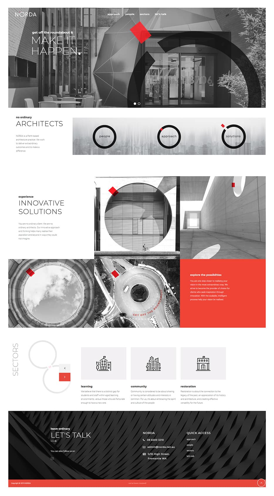
Bring it to Life
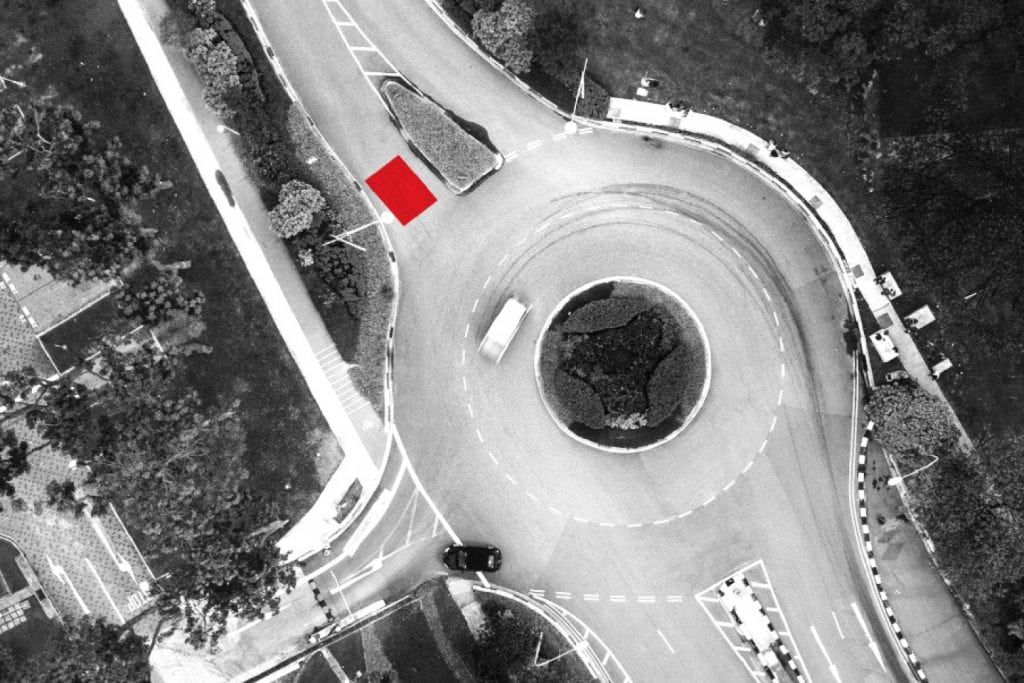
The brand direction required a minimal yet expressive identity, suitable to be used in a wide range of practical marketing applications. We created a The Norda “O” device and meaning “off the roundabout” is not limited in usage as static element. There is an inherent sense of movement/energy and intrigue in the device that allows for communication and expression. Use of the motif is designed be abstract and compelling – never cliche or expected. Expressing themes of solutions / possibility / inspiration / competitive difference are all possible with beauty and simplicity.
The logo for NO ORDinary Architects – is a reinforcement of the fact that as a NORDA client, you are not on an ordinary/expected journey nor will you receive an ordinary outcome. You can expect something special. This begins with giving you the expertise and clarity to realise your vision, give you clarity and help “get you off the round-about” of average service, expertise and outcomes.
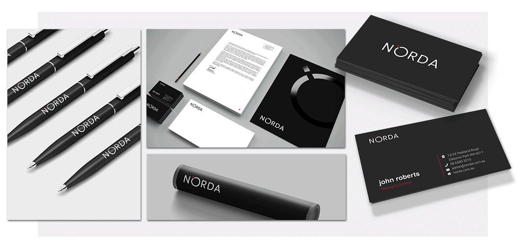
The NORDA red captures attention – it represents their passion and sense of adventure, the desire for extraordinary outcomes and to excel, akin to an inner flame. The excitement of NORDA red raises blood pressure and quickens the heartbeat, conveying power and desire. Red focuses behind the retina forcing the lens to grow more convex to pull forward. This gives a sense of motion and direction to the “O” motif.
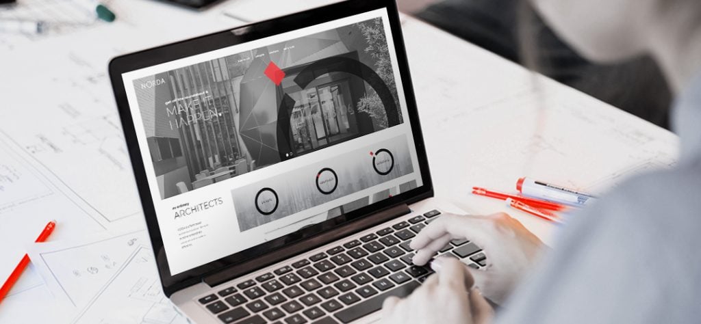
As part of the implementation phase of a full rebrand, we created an exciting new aligned vision of the future for the brand. It expresses a tone and unique visual language that mirror’s the passion of the NORDA team, while speaking directly to their ideal customer. The site like their approach brings a unique and fresh perspective to beautifully innovative solutions for complex architectural requirements.