// STRATEGIC BRAND REBOOT
CLIENT: imfs (In Mortgage & Finance Services)
BRAND CONSULTANCY | PROCESS IMPROVEMENT | MARKETING STRATEGY | WEB DESIGN | DIGITAL & PRINT EXECUTION

Challenge
After over 20 years of success, a new milestone was reached in the imfs journey. Catalysed by an internal restructure, consolidation of leadership and desire for clarity a new journey began with the intent of reigniting the fire. It was the perfect time to reassess the imfs strategic direction and start distilling the brand identity and quantifying the intangible factors already responsible for success.
Dovetailing a broader strategic piece, a brand discovery was embarked upon with a willingness to pursue difference, without constraint. Due to timing the branding and strategic piece benefitted from a synergistic effect revealing the road ahead with undoubted clarity.
Everything from strategic marketing direction, identity, positioning, value proposition, customer experience, team and all aspects of marketing collateral were explored in an intensive facilitated process engaging the broader team from the onset. The discovery pulled apart all aspects of the brand, forcing the team to challenge everything. During the brand discovery it became increasingly clear that the further the team’s perception of the imfs brand was pushed apart, the closer it pulled together and the clearer the message became.
Approach
A unified vision for the imfs brand that had the potential to both deeply connect internally with the team and externally across client groups was already there, ready to be revealed. The approach naturally shifted toward a brand reboot that allowed connection of the past, present and future of the imfs brand. It was this sincerity and shared belief in the imfs values that allowed for the discovery of what is in.
- Change of directorship symbolising new beginnings.
- The desire to project an image of integrity, professionalism, and high-quality outcomes.
- Realise increased market share, extending to a more affluent segment.
- Reinvigorate teams as the future of the business.
- Strengthen brand recognition and market profile. Reinvigorate and empower teams as the future of the business.
- Create a modern and highly relevant brand image in tune with today’s clients.
- Initiate a marketing strategy for driving increased business.

Utilising Noop BPM to organically facilitate a detailed brand discovery we established an authentic shared vision that strives to:
- Build genuine and lasting relationships, with clients and each other
- Deliver tailored and guided processes with resources that can connect customers with products
- Attract the most talented and experienced staff in the industry
- Be inspirational
- Be resilient as individuals and together in the market


The process surfaced the realisation that it’s in everything woven together that already makes the brand unique. It’s in their many diverse aspirations together with a unified vison which already seen substantial success and growth. Feeding this back into Noop BPM for the next iteration, allowed this difference to be quantified in a measurable and inspiring way, setting the flight path, deploying the flight crew and clearing the runway for absolute take off.
Established in 1998, imfs was one of the earlier entrants into the mortgage broking industry in Western Australia. Born from the need to provide clients with good old-fashioned service, the emphasis being to listen to the clients’ financial needs and offer a personalised solution. The market was full of competing brands and unimaginatively similar identities, using countless variations of the standard corporate blue and yellow palette. A trend that while perceived as communicating trust, lacked warmth, personality and difference.
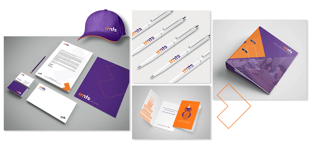
Enter, imfs a young and optimistic brand flying radically different flags blazoned in purple and orange – colours that are vibrant, creative and encouraging in feel. Very different for its time, the colours were a rebellious marker of the commitment of entrepreneurial women promoting confidence and difference in a male dominated industry. The proud colours of caring and professionalism that were there from the beginning, were a symbol of professionalism and care for both clients and team.
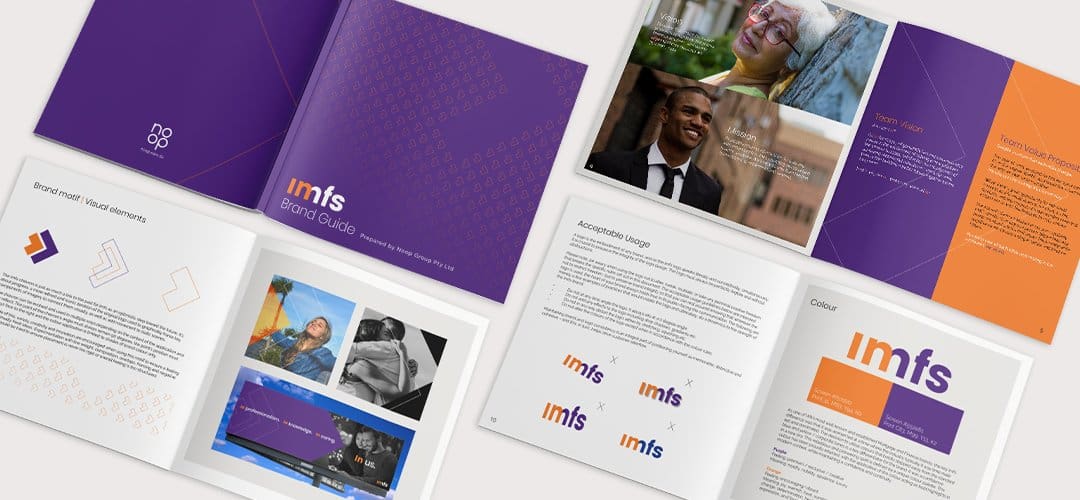
Embracing this legacy and unique difference, while strategically distilled the essence. The imfs chevron is just as much a link to the past for imfs as an optimistic step toward the future. It’s about progress, a more refined and iconic iteration of the original logo used to graphically frame key components of imagery to connect them visually, as well as add a dynamic movement and energy.
Results
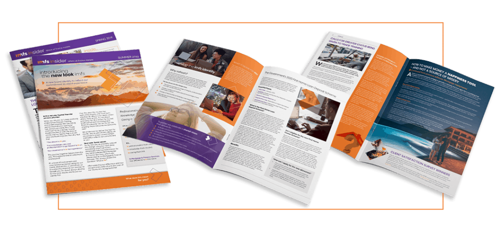
Since the brand launch, imfs has seen strengthened brand recognition and market profile and clearly articulating the USP and value added customer experience. In addition to having a clear roadmap for brand direction and execution they have also benefitted from invigorated team energy, which flows onto customer experience across all touchpoint. Facilitating attraction of increased enquiries from ideal customer profiles and consistent conversion. Positive feedback from existing customers proud of their alignment and the future strategic direction of imfs has been received.
“We used NOOP for a re-branding exercise, to basically re-fresh the look, reinvigorate the staff, and ultimately grow the business. NOOP were so different to everyone else that tendered for our business. They were fresh, dynamic and were prepared to listen and adapt to our needs, all the while, guiding us in a different direction if they thought it prudent. They were a pleasure to deal with, and the outcome was everything and more than we had hoped for.”