// REFLECTIVE SCHOOL REBRAND
CLIENT: JSRACS
BRAND CONSULTANCY | DIGITAL & PRINT EXECUTION
Discovery
On commemoration of its 30th anniversary, John Septimus Roe Anglican Community School wanted to challenge its brand position and understand the best way to honour its legacy, while driving toward a positive future as school of choice.
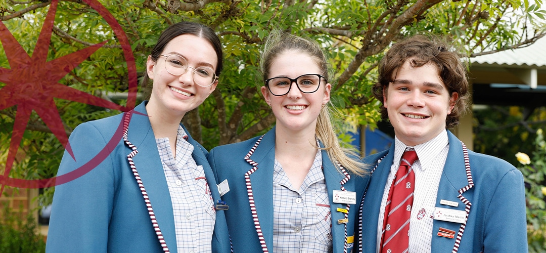
Having initially opened its doors in 1990, JSRACS has become a become a dynamic, cohesive, and proud community of learners that spreads over two diverse campuses. With an enrolment of over 1,750 students from over 1,150 families, the success of the school has been dependent on clearly articulating the values of the school to its students, parents and staff and the establishment of procedures and practices that make those values as tangible as the bricks and mortar that make up the buildings.
Approach
Looking to secure its future position JSRACS engaged noop to distil the essence of the school’s identity while appealing to emerging demographics. A brand audit was undertaken and utilising Noop BPM, the connection to the existing identity was tested, this allowed JSRACS to quantify internal and external perception , affinity for the existing school image and exactly how far things needed to shift. Building this emotional connection into a refreshed brand required deep understanding of the core school values, in order to inwardly establish the formula for success before outwardly driving change and reinforcing the position. While the school has a strong focus on pastoral care, it’s the quality of the relationships that give rise to the tone of the school. With this in mind, secondary motifs were designed to create an interplay between the refined legacy elements and to add visual interest and depth to the school’s marketing collateral.
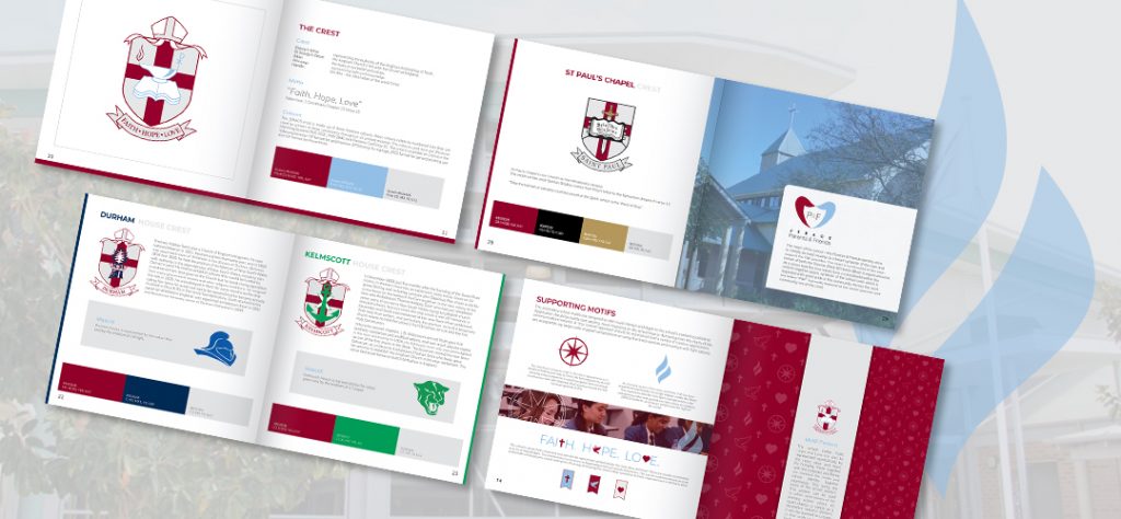
The directional compass motif is star like in appearance as it relates to finding your way to Christ, the learning journey as well as being a key component in naval navigation and surveying synonymous with namesake John Septimus Roe’s journey toward the first surveyor-general of WA.
Their iconised version of the lamp and flame was streamlined significantly to a single elegant candle like flame. This represents both the Holy Spirit and light which is the underpinning value and guiding love that shines on students. JSRACS students, as all Jesus’ children are the “light of the world”.
With Christian beliefs and lifestyle as the foundation the school values are:
• Faith: Faith in Christ / Faith in each other / Faith in ourselves to make a difference.
• Hope: Hope in Christ / Hope for each other / Hope for a better future.
• Love for Christ: / Love for each other / Love that knows no boundaries.
These are the foundations of a dynamic, Christian community that offers a broad, high quality education to students from diverse backgrounds.


The intersection of the school’s values Faith, Hope and Love had been evolved represented symbolically by the cross, dove and heart. These are visually summarised as a set of flags/badges to be used decoratively as a set underneath school prayers, creeds, and hymns. It is a way of showing the school’s deep connection to Faith, Hope and Love in all that is done. Inputting the value symbols through noop BPM again showed the school motto Faith, Hope and Love can also be represented symbolically by the cross, dove and heart. By bringing these together with the compass and flame, we interlock the motto and school identity together seamlessly. This forms the basis of the school pattern. This pattern can be used to soften solid blocks of the primary school colour, as insert sheets, or simply as a decorative textural element. It can be zoomed to a larger or finer
Results
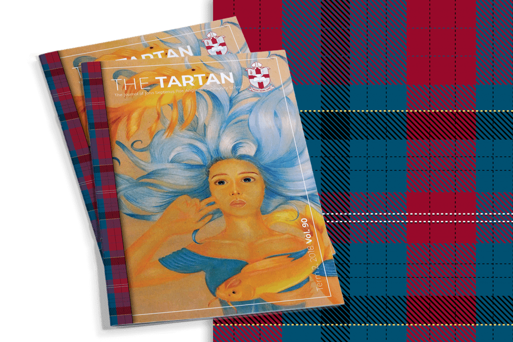
To seamlessly tie in all components of old and new seamlessly the original school tartan was revisited and recreated as vector element that can be used as a decorative element. It can now be used as a binding element for print publication, or uniquely shaped and set underneath photography. Helping to maintain visual interest.
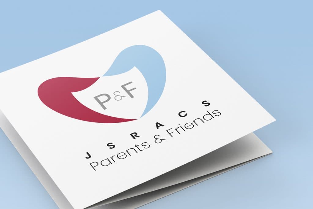
The new brand feel was also extended to the P&F committee establishing the community as the heart of the school. The Parents & Friends identity aims to initially be read visually as a heart symbolic of the care and support the P&F provides. The heart is constructed of the open hands of both the Parents (Red) & Friends (Blue) in equal amounts. At a closer look, the two hands form a crest/shield within the central negative space, symbolic of the school crest which is regarded with great pride in the community. Across the crest the letters “P&F” are proudly featured at the centre (parents and community are at the core).
Together with a deeply meaningful mission and freshly articulated brand feel, JSRACS are empowered to embrace the educational challenges and opportunities of the future, where each student is encouraged to explore their spiritual, intellectual, social, physical and creative capacities, not just for today but tomorrow and beyond.