
What is Visual Hierarchy in Web Design?
The term visual hierarchy is used to differentiate between a website that strategically impacts on the users decisions and flow and a website that only “looks good”. Renaissance masters knew the principles of aesthetics and so does visual hierarchy which relies on these exact same values. The secondary goals of the sites are the call to actions, encouraging user signups and promoting specific content all while ensuring the users experience is enjoyable and not just about a fulfilling their objectives.
One of the fundamental functions is to determine the users focal point, thus providing the user with a starting point to navigate the design and highlighting or leading them to the most applicable information on the site. There are numerous ways in which a designer or developer can emphasise design elements whilst creating a visual hierarchy with attention on the focus and flow.
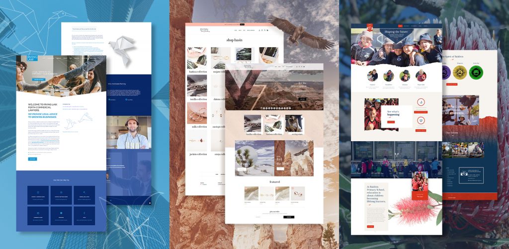
Visual Hierarchy in Web Design
Here is some of our work, showcasing how we apply visual hierarchy to guide users through the content and create a natural flow in the design.
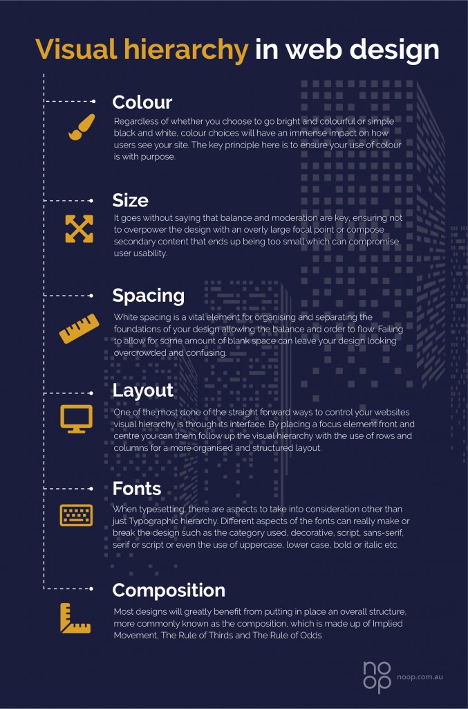
Colour
Regardless of wither you choose to go bright and colourful or simple black and white, colour choices will have an immense impact on how users see your site. The key principle here is to ensure your use of colour is with purpose. Know your colour hierarchy in that darker colours such as blacks and reds will draw more attention, whereas softer creams and yellows may be more subdued. The use of contrast can enhance or even reverse the effects. In design, there are lots of amazing ways in which colour and contrast can be translated into a design to guide a user eye, such as the Saturation, the value and the Temperature. If we break down the design, you can really get a feel for how the visuals, colour, and the typography can lead the eye to the focal point of the design.
Size
We all know the old say, “The bigger the better” and yes, bigger is more eye catching, but it’s not necessary always better. Its fine to have the most important elements standing out, but when we get down to the specifics can become a little more complicated. Consider reducing the design elements that aren’t as significant or specifics that you feel you want to de-emphasize in turn making them less evident, resulting in a lower the visual hierarchy. It goes without saying that balance and moderation are key, ensuring not to overpower the design with an overly large focal point or compose secondary content that ends up being too small which can compromise user usability.
Spacing
One of the most important yet often ignored design principles is the use of White or blank space and spacing. White spacing is a vital element for organising and separating the foundations of your design allowing the balance and order to flow. Failing to allow for some amount of blank space can leave your design looking overcrowded and confusing.
Layout
One of the most done of the straight forward ways to control your web design Perth’s visual hierarchy is through its interface. By placing a focus element front and centre you can them follow up the visual hierarchy with the use of rows and columns for a more organised and structured layout. This can help keep the chaos at bay and also leaves some space at the end for CTAs or other chosen content. It can be a tedious and fiddly balance but crucial if you want to avoid overcrowding your website with too many elements. The visual hierarchy can flatten and very little will stand on the design.
Fonts
When typesetting, there are other aspects to take into consideration other than just Typographic hierarchy. Different aspects of the fonts can really make or break the design such as the category used, decorative, script, sans-serif, serif or script or even the use of uppercase, lower case, bold or italic etc.
Composition
Using some of the techniques in the article can help Guide user through your design and layout, but overall most designs will greatly benefit from putting in place an overall structure, more commonly known as the composition, which is made up of Implied Movement, The Rule of Thirds and The Rule of Odds.
Takeaway – Two of the most fundamental and interconnected skills in web UI design are applying design patterns and the understanding of visual hierarchy. One you have mastered how to prioritise information, you will have a healthier idea of applying existing design patterns. Do not place visual importance on too many of the design elements otherwise the whole thing can become equivalent. If everything is standing out, then unfortunately nothing will stand out. People naturally scan for information, so ensure you prioritise your spacing, colour, contrast and size.
The fundamental rule when it comes to Visual Hierarchy is that some elements can be emphasized while other must take a back seat.